
Beautiful Event Homepages | A Three-Part Round-Up
You need to seek some tranquility when you’re at a busy start-up. Something I’ve learned since starting here is that that specifically is one of the nice things about good design – it’s a calming presence. Especially when you stumble upon it in the ever-more-tangled, worldwide web with so many options to choose from.
Here, as a break from the norm, the theme of this week’s event round-up comes from what the event pages look like, not just what they’re about. Good design is one of the main factors that pushes people towards trusting a website, and ultimately buying from you, so it’s worth having a look around to see what options are there from which to gain inspiration:
MirrorConf
At first glance, you might have an aneurysm. But it’s under construction:

You can, however, buy tickets here.
I wanted to bring up Mirror Conf, not only for the virtue of their previous conference website incarnations, which you can see a little bit further down, but to show what can be achieved by a pixelated QWOP-esque man hurtling through space: humour.
Long gone are the days of black and white 404 pages (for most people.) Placeholders are becoming more dynamic on the modern web because they too are seen as ways to communicate what your brand has to offer.
This is particularly relevant for yearly conferences and events where people will come looking for the next installment (hopefully) once they’ve been to one previously.
For a more accurate representation of what this team can do (they’re a front-end conference, for goodness’ sake) we should look at last year’s event homepage:
.gif)
Or, better yet, you can check out their current ticket page here.
The Hunt: NYC LGBT Sites
When I first read the event title, I somehow missed the word “sites” and was very confused.
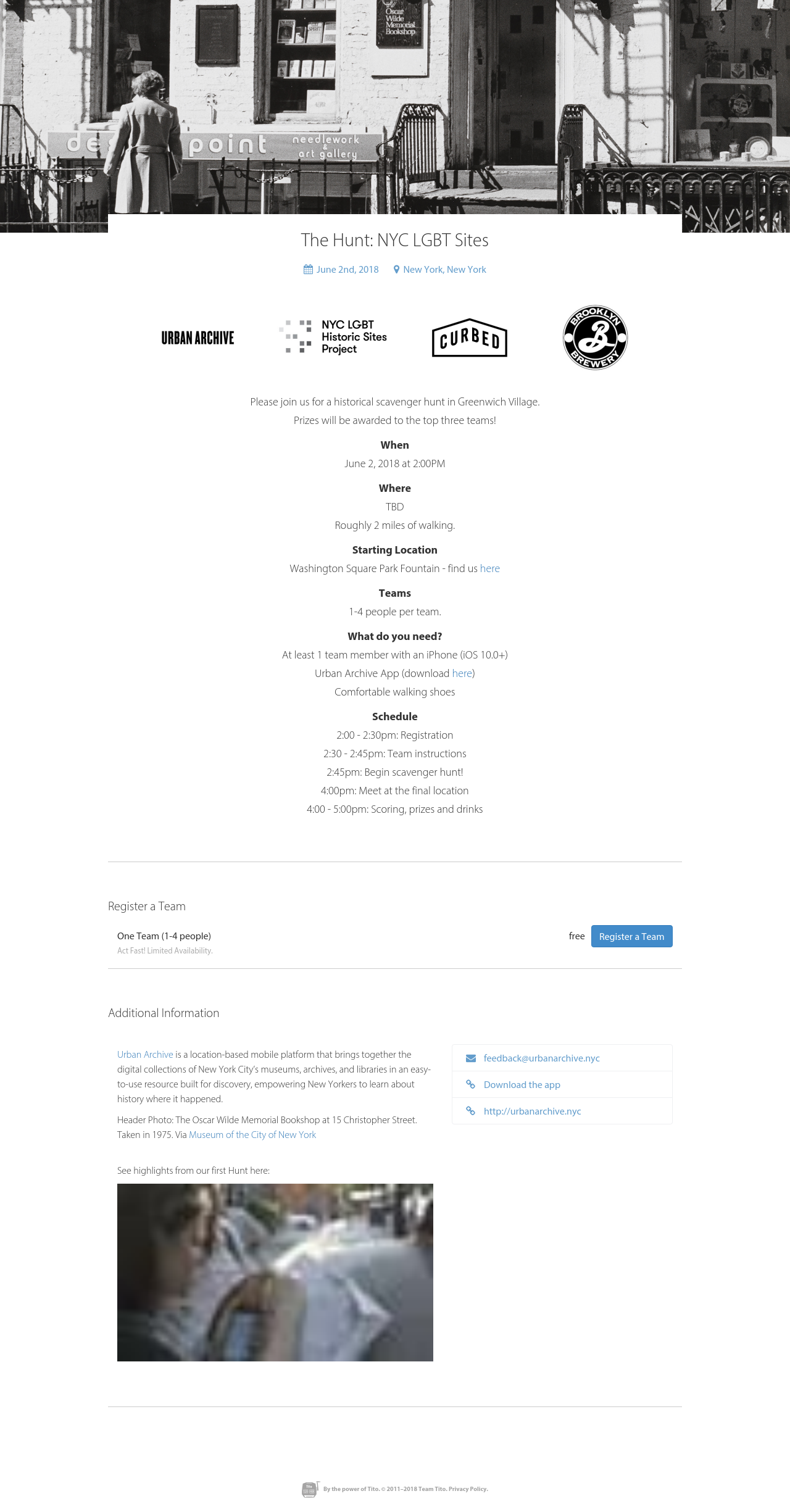
The minimalism! The centre-alignment! The picture of old Christopher Street! ❤️
Beyond these, there are a couple of other things that lead people to want to covert on this page because of its design:
- The CTA copy – instead of the standard “TICKETS,” they’ve opted to add a human element to the fold, encouraging people that they won’t be in it alone. They’ve gone for “Register a team” which gets the visitor thinking about the event in terms of who they can go with, and the associated fun of getting together with friends to roam NYC.
- The where, when, what, and schedule – when you can fit the bones of an event or workshop into less than 400 characters, you’re on to a winner.
- The video – which you can’t see (unfortunately) in this example, because it’s a static shot, but the use of multimedia here gives you an insight into exactly what you can expect. Having it embedded on the event page means that potential attendees don’t have to click off to get more information before registration.
Here’s how they did it.
Fifteen Seconds
Infinite scroll is a good thing…

… told you.
And yes, the page is mostly in German, but the design and inclusions advertise the conference’s positives without needing verbal description.
There’s a couple of components that I love about this site, beyond the fact that they manage to pack so much in, and hold attention spans all the way to the footer.
- Testimonials – before people part with their money, they want reassurance that what they’re getting in for is something that their industry-peers have felt inspired by or enjoyed. Testimonials are just the trick.
- Pricing phase outlines – a number on its own is just a number. Here, they’ve outlined exactly what you get a when with each pass. They’ve also outlined when each type is available so you can budget or schedule accordingly.
- Highlighting their big-ticket attendees – much as you go to a festival for a line-up, so too do attendees flock to conferences where they recognise a business whose principals or techniques they want to emulate.
- Speaker profiles – this one goes without saying, to my mind, but you’d be surprised how often speaker profiles are an after-thought. Highlighting the core competencies and topics being covered by presenters as early as possible is a great way to show value to potential attendees.
- Visuals that show their numbers – the audience size illustrated in the photos from a previous conference are a great way to sell the popularity of your conference. There’s ultimately a voice in the back of potential attendees’ minds saying that “if everyone’s doing it, I should be too.”
You can get tickets through the page I’ve screenshotted above, or via this link.
Or, if you’re just in the market, for recommended reading, you can check out some other round-ups we’ve previously produced: here, here, and here.