Pause and Rewind Part II: Orders and Modules
Following on from my previous work updating the Attendee viewer, I spent a couple of days this week updating the Orders viewer, as well as applying some reusable modular sass magic.
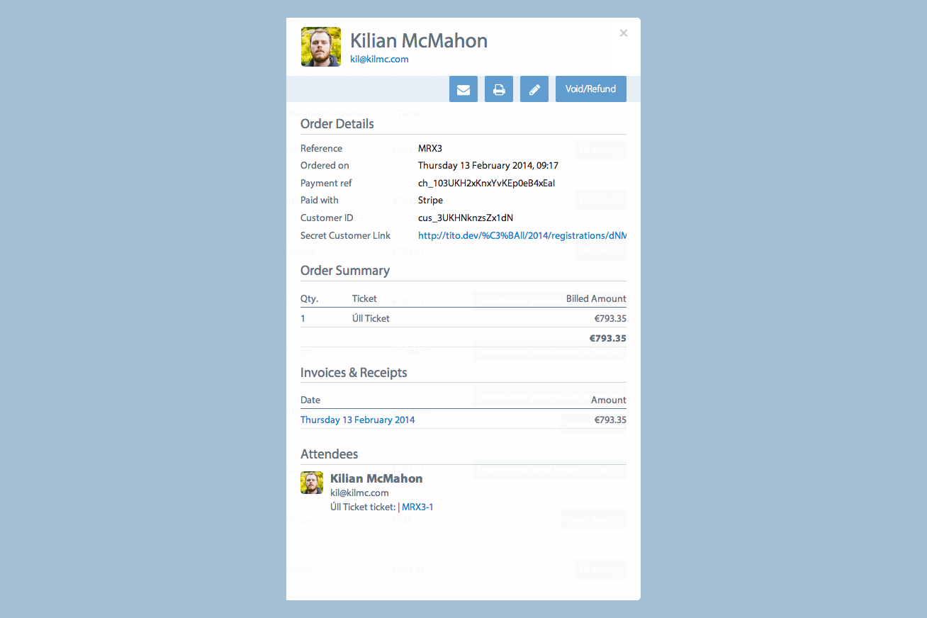
Initially I tried to match the style from the Attendee module. It seemed to make sense that I should keep things consistent but the result was actually a loss of information hierarchy. The viewer became very heavy and bloated, and worse still it was becoming indistinguishable from the Attendee module. With the overall aim being to have a distinct visual language for each element, this wasn’t a good direction.
As with most things in life, discussing it with someone else helps greatly. After a brief chat with Doc I began to base the Orders design on what we dubbed the ‘mini’ Order module which I had created the previous week.
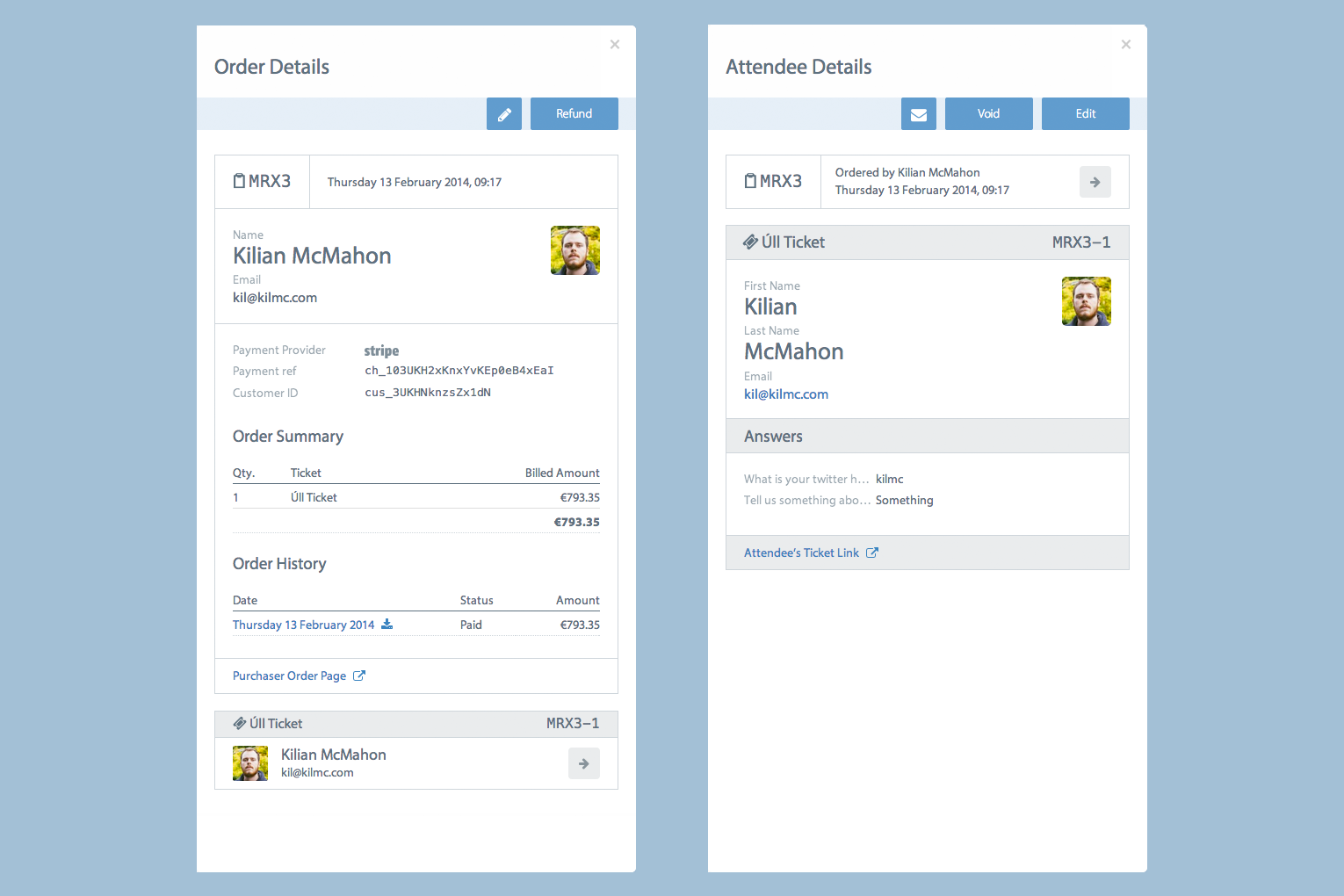
The final part to tackle was creating a design for the ‘mini’ Attendee module. Thankfully that was a simple process as all the design decisions were essentially made in the main Attendee module—it just needed to be made more compact.
This redesign has taught me a huge amount about designing with clarity in mind. Just because something is consistent, it does not mean it’s easy to understand. By adding clear visual hooks (such as an icon, or an avatar) these modules become a lot easier to identify, rather than having to read the content to figure it out.
I hope that taking this approach with other aspects of Tito will bring a new level of ease and enjoyment to the usability of the app.