$30m, and a Preview
Our last post in June was an important one: $20m worth of tickets processed in the first 5 months of 2014.
We’ve been working hard for the last few months to improve our product lineup. We’ve put in long days and nights to address the entire experience of using Tito, from the organiser of an event to the person purchasing a ticket, to the volunteer at the door.
At some point during the summer, we realised that we hadn’t shipped a feature or posted any news to the blog in a few months. We joked at the time that our next blog post was probably going to be announcing $30m worth of tickets sold.
Well, as it turns out, it is. Earlier this month, just 3 months later, we crossed $30m.
To celebrate, we thought we’d share a preview of the things that we’ve been working on.
One of the most requested Tito features is a fully integrated registration process. Apple’s introduction of Continuity earlier this year marked a watershed moment in how we think about apps interacting together… it’s been clear for many years with Mashups and third party APIs that inter-app communication is a powerful tool, but Continuity shows how elegant integration can be.
On the web, Stripe turned heads with their seamless Checkout experience. Stripe weren’t the first to implement a third-party overlay for taking payments, but Stripe Checkout made the process exceptionally smooth, and the integration is simple.
In the domain of customer interactions Intercom’s Messenger is setting new standards for the kind of functionality that can be integrated into third party apps with just a few lines of JavaScript.
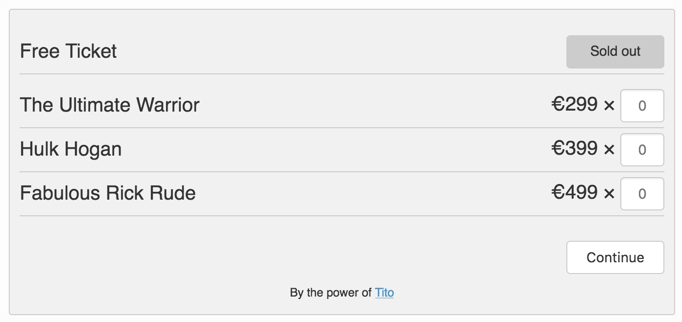
Inspired by this backdrop of third-party embedded experiences that feel great, earlier this summer, we set to work on a new, embeddable Tito registration experience, and I’m delighted to announce that the new Tito embeddable widget is available in beta.
The new widget is available as a ticket form or a button, and it is forward-compatible with the new Web Components W3 Spec. Web components represent the future of how integrations will be shared across apps.
Here’s a sample of the new widget:

Check out our beta docs if you’d like to use it for your self. It’s also way more customisable than before.
It’s dead easy to implement, and buying a ticket using it is super smooth. We’d love for you to try it out.