
What I Learned from 8 Years of Conference Badge Design
The Tito office is something of a hub for conference materials. Between the events we host ourselves, the publications we put out for organisers, and the memorabilia we have from being attendees in the past, you’d think it would be a bit of a mess.
Thankfully, it’s controlled chaos. That said, every now and again we’ll reorganise and find something we hadn’t exactly been looking for, but that we’re very glad to see.
Like every conference badge we’ve ever had:
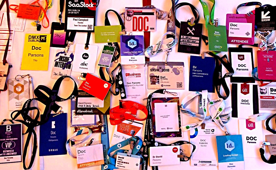
The above is a not-so-small sample of the conference badges that Team Tito has collected over the past 8 years (and yes, most of them are Doc’s).
I haven’t been on the conference circuit for quite as long as a lot of my colleagues, so while they’ve come close to seeing it all, I came upon The Box and was fascinated to see the diversity of the conference badge design that’s been on offer for the past (nearly) decade.
Here are a few things I learned by picking through them:
1) You don’t have to re-invent the wheel

You might be familiar with Úll if you’re a Tito user. If you’re not, Úll is “a conference for people who build and love great products. [It’s] focused on great product stories, presented through an Apple-shaped lens.”
It/Paul is taking a year off from hosting in 2018 for various reasons, but the lanyards he designed will be very memorable to those who were previously involved. I asked Paul why he chose that specific design (and more than once):
The design changing only a little bit was because we wanted to model the design of the conference on the iPhone … a big change every 2 years. “Tick-Tock.”
In terms of why we went for specific designs, again it was mostly Apple-centric. Although, the first year, it was because we had time constraints and not enough time to send them off to get made, and Kilian was a whizz at papercraft so he did handmade versions. We wanted the welcome pack unboxing to feel like the unboxing of Apple products.
2) Being beautiful doesn’t mean you can’t be useful…
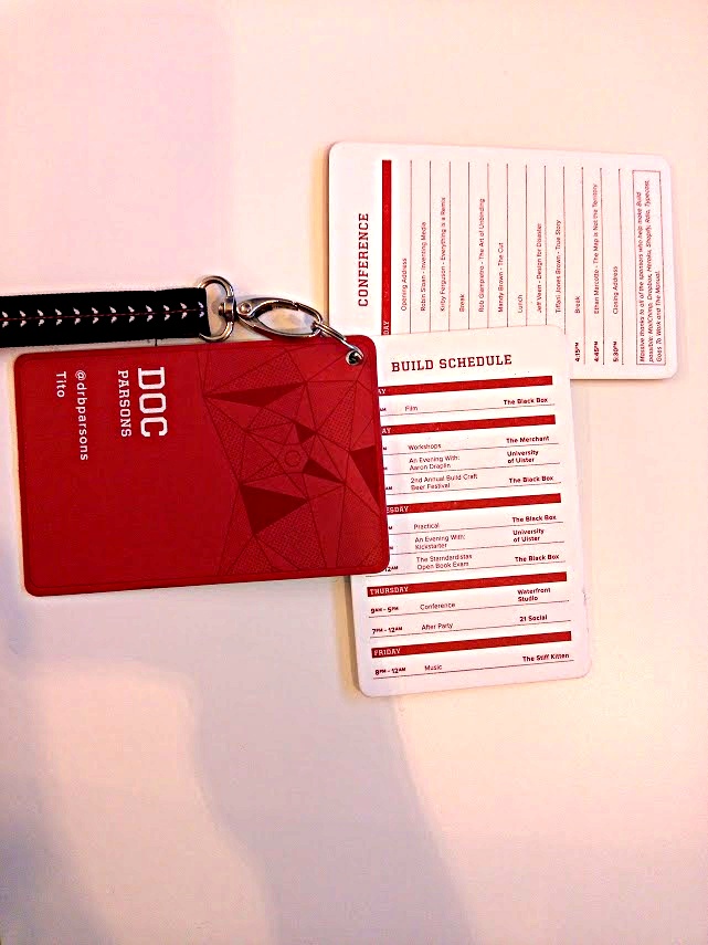
(As a side note, I want to give extra points to this lanyard from Build that was printed on some of the most delightful paper I’ve ever held.)
Unsurprisingly, 96% of people say it’s important to be able to recognise a person by name when doing business, but the potential for name tags at conferences stretches well beyond just being able to know who somoene is. While not quite as simple as the design for Úll, Build built their lanyard in three parts:
- The front, with the attendee’s name, company, and Twitter handle,
- The middle card, with the workshop and festival activities, and
- The back card, with the full conference breakdown.
This means that, not only do attendees know what they’re doing, you can also focus on what you as an organiser are meant to be doing for the duration of the event. instead of having to dedicate parts of your team to helping audiences with the schedule. Functionality isn’t sacrificed in favour of form in this conference badge design, nor is the planning team’s sanity. Win-win.
Sadly, Build was discontinued in 2013, but Andy is hard at work building XOXO this year, where you’ll get to see yet more of his team’s design experience put to work.
3) Conference badge design is a networking opportunity
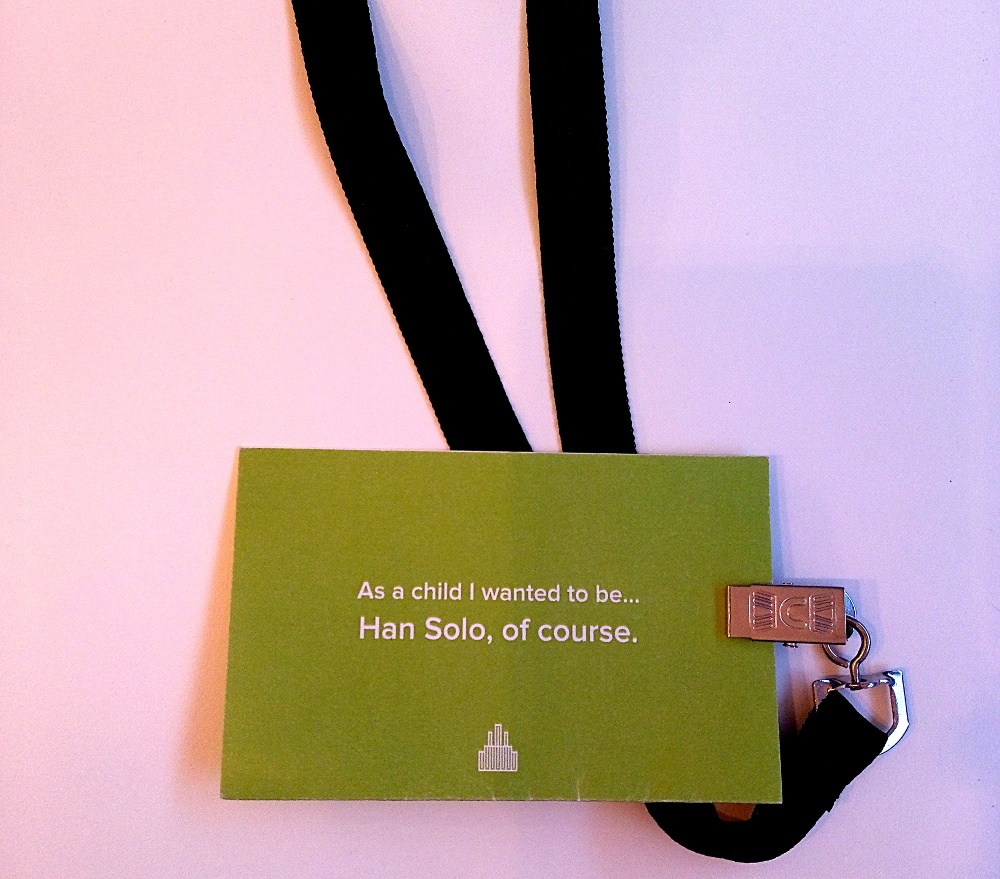
If you’ve ever used our software, read more than a page of our copy, or spoken to almost any member of the team, you’ll be familiar with the group ❤️ for Star Wars.
I had a personal connection with this one as I thought about whether I would want to grow up to be “Han Solo” Harrison Ford or “Indiana Jones” Harrison Ford. Straight afterwards, I wanted to talk to Doc about it. Hey, presto!
The possibilities to strike up conversation significantly increase when you add in celebrities, fictional characters, or anything that two people can bond over being passionate about. If you amplify this by literally wearing it around your neck, you’re on to a winner when it comes to making networking easier.
Industry conf was pretty good at that anyway. The conference took place from 2012 to 2016. The mission statement of the conference started with:
I believe that bringing the right amount of people together with some of the greatest minds will help us push forwards together.
The “I” referred to here is Gavin Elliot who now spends his time as a Dad, working as Head of Interaction and Service Design at DWP Digital, and as a professional speaker through which he’s still spreading the good news of good design, overcoming interpersonal insecurity, and quality leadership.
4) Simplicity is the heart of utility
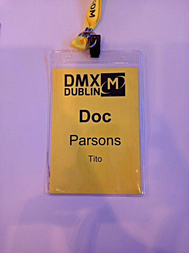
I’m awful at names. It’s gotten to the point where I begin or finish every sentence with a new acquaintance by saying their name, and end up sounding like an answering machine. As such, I dream of a utopia where there’s mandatory self-identification in big letters on your chest.
At least, at events.
Badge Reviews says that your optimal conference badge should be designed with 15′ readability as standard using a minimum 72pt font.
If you have even basic aspirations for your badge functionality (i.e. that you a) want to know who other people are at your event b) that you want to know who should and shouldn’t be attending and c) that you want to facilitate people’s interactions) then the elements above are really all you need. Everything else is an extra.
Simplicity can (paradoxically) be one of the most complex aspects of design to do right, however. It’s likely that a lot of thought went into readability, as we’ve mentioned already, but also into colour choice. Fans of the significance of colour will tell you that the colour yellow is the colour that captures our attention more than any other as the brightest in the spectrum. Furthermore, its choice as a suitable shade to symbolise the aspirations of the event will come as no surprise if we accept that yellow represents happiness, optimism, enlightenment, and creativity.
DMX put this into practice masterfully above and, as Ireland’s largest digital marketing conference, it’s no surprise that they know a a thing or two about branded materials.
5) Express yourself
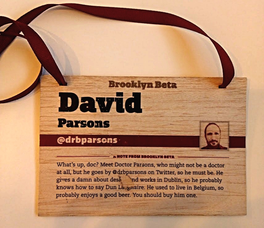
Brooklyn Beta was always focused on the people that make up its community, as you can see in their four guiding principals:
- Unite the community by creating gathering spaces — both online and offline — and by highlighting common threads. As often as possible, we want to bring the community together and remind everyone just how friendly and thoughtful their peers are.
- Inspire the community and instill the kind of relentless optimism needed to confront hard problems, big and small.
- Direct the community by shining a spotlight on problems that matter and by surfacing issues that reach beyond the boundaries of our own community and help other people, too.
- Support the community in as many ways as we can think of. This also means helping community members support each other.
If your badge can make an introduction as simple as, “What does your one say about you?” you’ve stuck gold, especially when you’re aiming to ingratiate someone into a community that may have known each other for years.
While there are plenty of tried and cherished “ice-breakers” that you can have ready to go when you’re trying to turn a stranger into a connection or a friend, when the organiser goes the extra mile to facilitate your authentic personality, that’s great.
This one from Brooklyn Beta has had some wear and tear (suspiciously to Doc’s old company’s name), but the point still stands. And he probably did get a few beers out of it.
Obviously a big box in our office doesn’t constitute even a drop in the ocean of conference collateral design. If you want to contribute to the conversation, you can share this round-up on Twitter along with any recommendations from your own experience.