We've redesigned Tito's event homepages!
tl;dr we’re updating the design of our event pages!
Over the last few months we’ve been working behind the scenes to port the remaining parts of our Tito codebase from “legacy” to “dashboard”.
While everyone using Tito to manage their events is already using the latest dashboard code, folks who come and register tickets are using various bits of our older codebase.
For the homepages, we’re tackling this update in two steps. The first step is already done and involved embedding our V2 widget to display the list of tickets and launch the subsequent checkout flow. The final step will be to serve the surrounding event homepage from our dashboard app.
While we were porting things over I must admit, I couldn’t resist the opportunity to give the design a little refresh. I know, in general, change is hard but hopefully you’ll love what we’ve done!
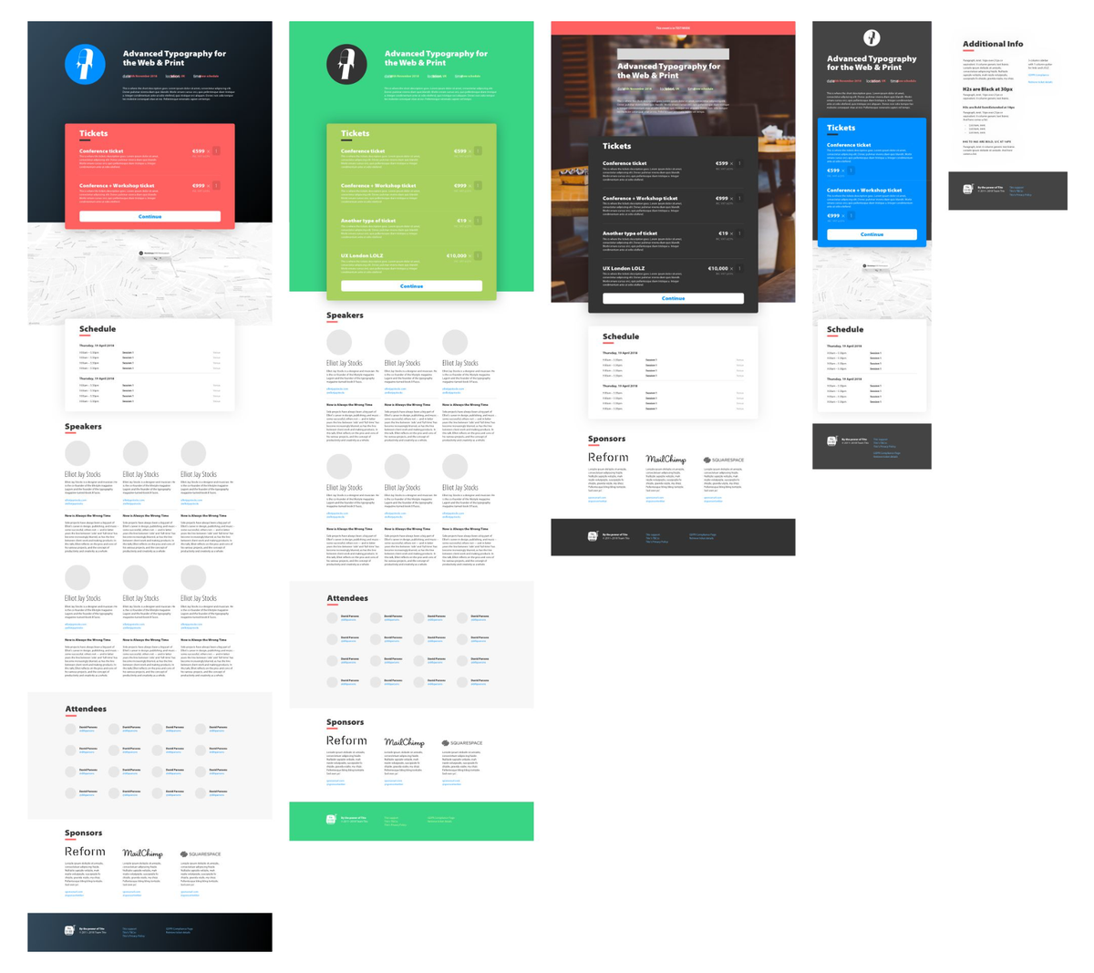
The new page design comes from a collaboration with author, speaker, musician and typography guru Elliot Jay Stocks who put together some layout options and design treatments for us to use as a theme… back in 2018/2019 (🙈) or in the before times pre-pandemic.
My main aim with the new designs was to address two bits of feedback we’d see come up regularly, namely:
- The event description text should be left-aligned rather than centred;
- The fluid full-width banners were causing issues for folks who wanted to include text or information in the banner images.
Elliot worked his magic and produced some mockups which we have implemented in a slightly simplified form in this first iteration.

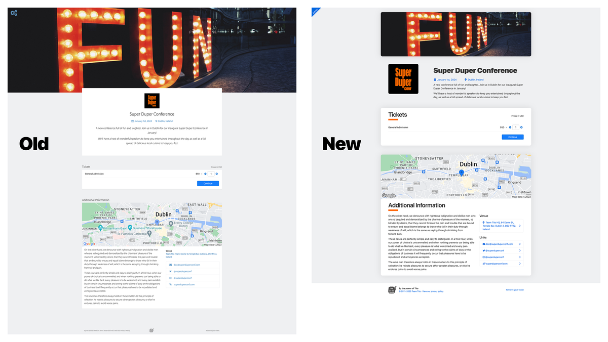
Here’s an example of the old designs vs the new design…

As you can see, in this first step we’ve fixed the size of the banner image which makes the overall page length shorter. We’ve also made the section headers clearer and improved the overall typography, as well as a bunch of little tweaks and tidies.
You’ll be able to change the heading highlight colour (the bar under the titles) as well as the background colour if you want to theme the page, and we’ll continue to offer custom CSS to those who would like to code their own styles.
With this new design we’ll be retiring the two older themes but we hope to offer some alternative designs in the not-too-distant future. Remember you can always easily embed our widget in your own site and fully customise the styles and colours if you want to give your customers a seamless checkout experience.
The new page design will be rolling out soon and we’ll send a message when it’s done so you can check for any issues! As usual, just contact us at support@tito.io if you need to get in touch.