Pause and Rewind
There are many advantages to working in a small team. Agility, fast decision making and cheap rounds. But with a team of four you inevitably have to balance endless iterations with shipping the features and updates your customers need.
Now that our new ticket flow is live we’re taking the time to go back to some of the areas that have been bugging us. Kilian goes through the first in a series of posts explaining some of the updates and design decisions. —Doc
In the last year small inconsistencies have crept into various parts of the app. Last Thursday I started to tidy up what we refer to as the viewers in Tito, where we provide more detailed information about list items like tickets, order and attendees.
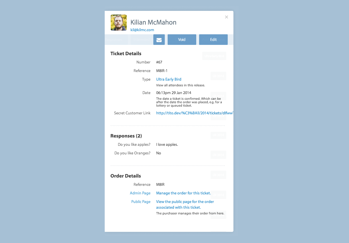
There was plenty wrong with this screen. The lack of hierarchy, messy alignment of the labels and a nasty URL all needed improving. My biggest issue though was that all the viewers had slight variations in type size, colour and content hierarchy.
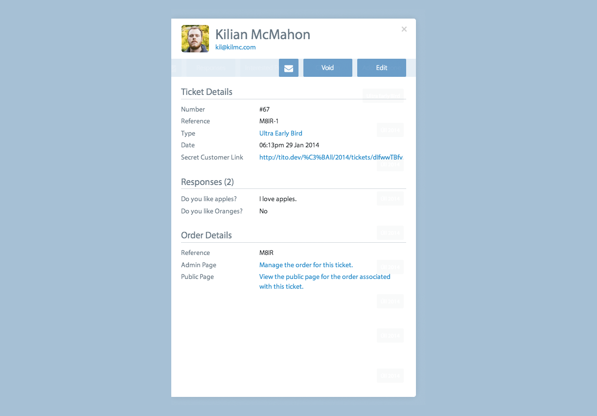
I widened the viewer by 50px to give us a little breathing room, then made the type size and colour consistent all across the various viewers and aligned all of the text left to keep it looking neat and tidy. This was already an improvement but the viewer was still lacking any kind of differentiation between say, the Tickets viewer and the Orders viewer We wanted the user to be able to glance at the screen and know where in the admin interface they were.
In an effort to keep things moving quickly I decided that it was best to just redesign the Attendees viewer first so we could ship something to the users and then improve Orders and Tickets soon after.
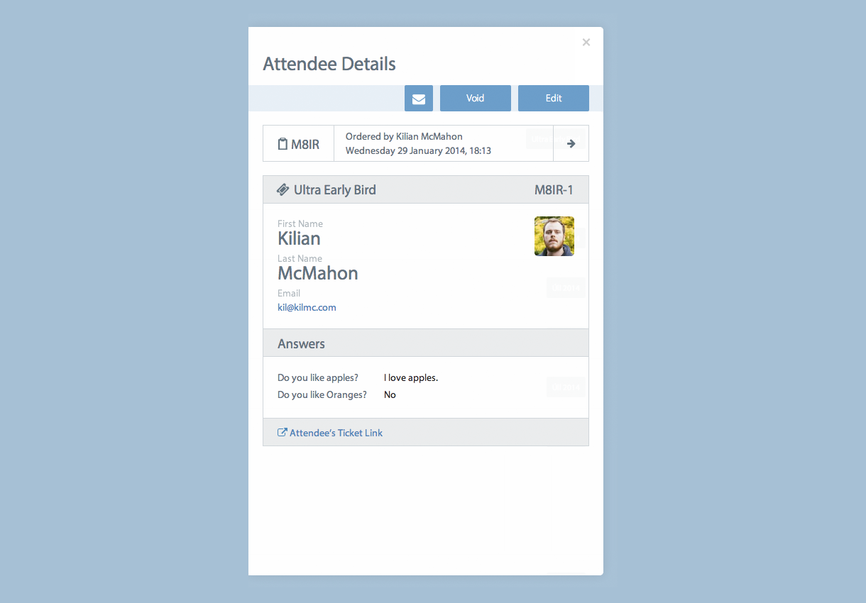
Taking inspiration from our newly designed tickets in the purchase flow I added a bit more structure and “ticketness” to the screen. The same information is there but with a much clearer layout for quick scanning, and easy access to the associated order or public ticket. Ultimately this is a first step towards a consistent visual language for the data elements within Tito.
This is just one of many small improvements we’ll be pushing live in the coming weeks to make sure Tito is just as tightly polished for organisers as it has become for their attendees.