Quick Tricks #18: Anatomy of an awesome banner (with examples)
Today’s Quick Trick is a bit different — in addition to learning how to do something in Tito, we’re going to be taking inspiration from some real-life Tito customers.
Want to jazz up your event homepage? Read on…
What? Learn how to add your own custom banner that appears at the top of your Tito event homepage.
Why? Our eyes tend to be drawn to images before they’re drawn to text. So why not boost your chances of attendees taking in information about your event by adding a visual element?
How? Head to Customize > Homepage to upload a banner that will appear at the top of your event homepage. Banner images should be a JPEG, GIF or PNG, and for best results the dimensions should 1800×530px (which will look great on retina screens).
Examples. I trawled a few customer events for examples of effective homepage banners to give you some inspiration and I’ll explain what I think works about each of them.
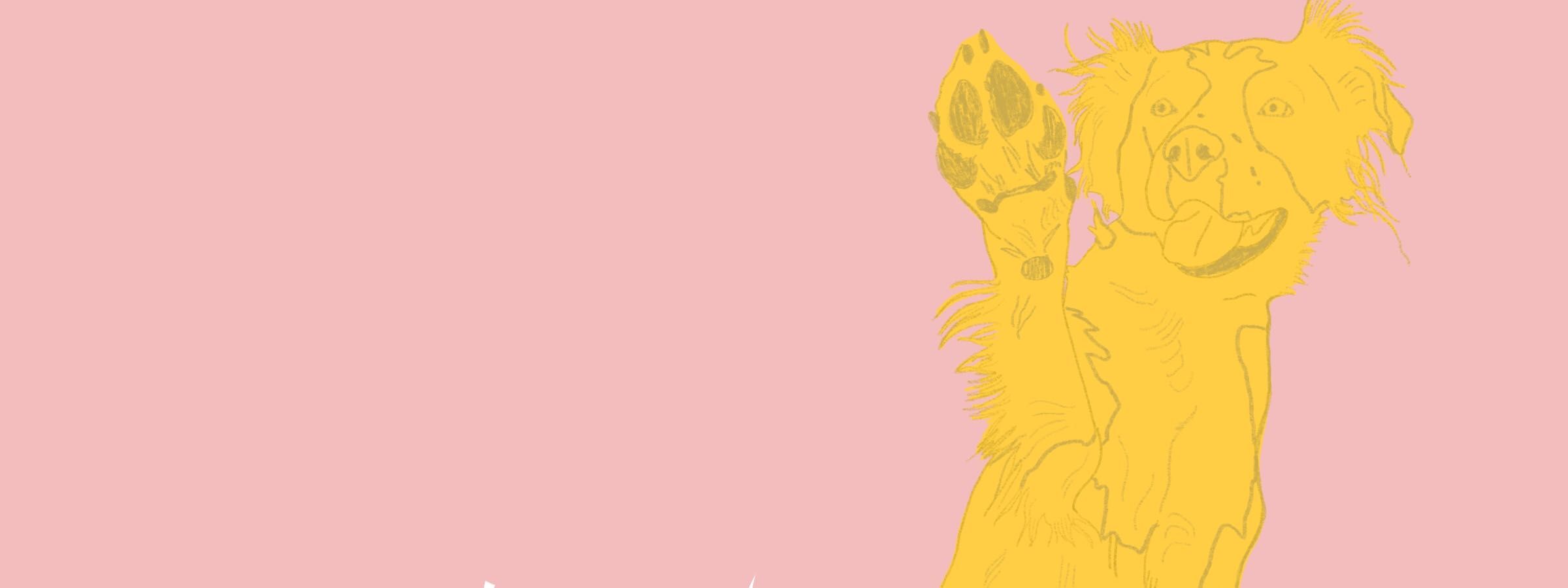
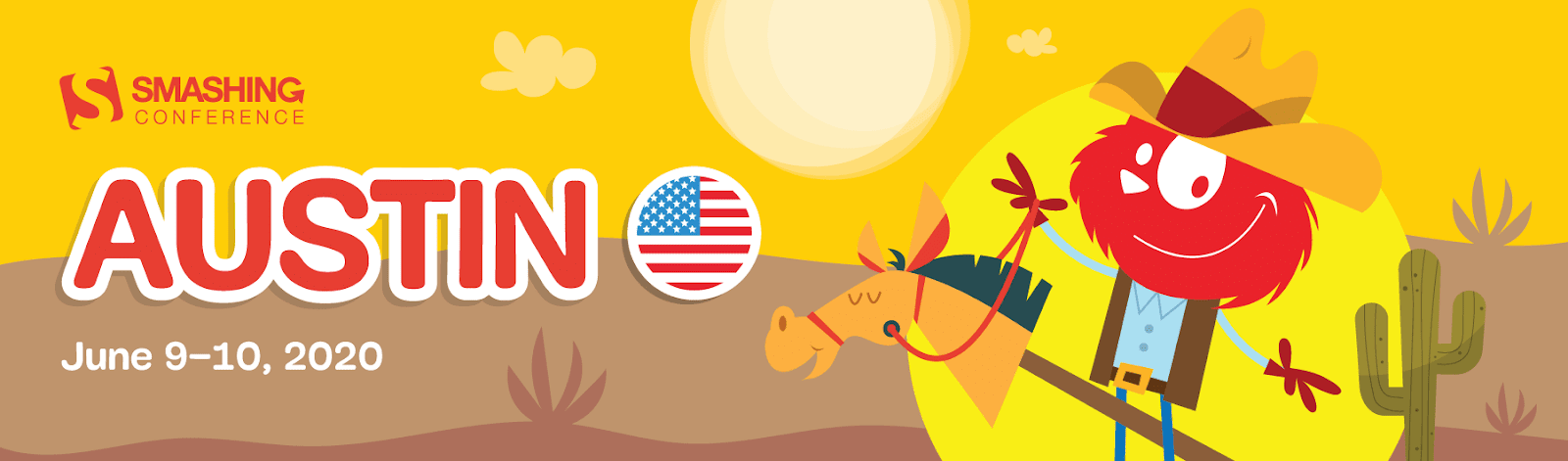
Let’s start with my absolute favourite example: SmashingConf. I have lots to say about this one!
Firstly, here’s the banner for their San Francisco 2020 event:

Here’s the banner for the Austin 2020 edition of the conference:
And here’s the banner for their Freiburg 2020 event:

Given that SmashingConf is a world-class event series from the folks at the iconic Smashing Magazine, it’s hardly surprising that they’ve nailed the banner design, but here are a few specific reasons why I love these examples:
- Their branding is consistent across all their events whilst still having oodles of personality. The typeface, the red in the palette, and the use of both the SmashingConf logo and their mascot Smashing Cat character in all of the header images draws everything together really nicely. You know right away that you’re looking at a Smashing production.
- Each edition of the conference has effectively been given its own sub-brand with the use of a different background colour, and the Smashing Cat has been dressed up and given accessories to match the location of the event, which is a cute touch.
- The design gives you a sense of what the event is like if you’ve never been before. Like the conference series itself, the banner design strikes a great balance between professionalism and friendliness.
- In terms of content, the banners are great because they emphasise the location and dates of the events. The use of the circular map icon is a nice visual shortcut too, to let you know you’re looking at the right event.
Let’s take a look at a few other examples and what’s great about them.
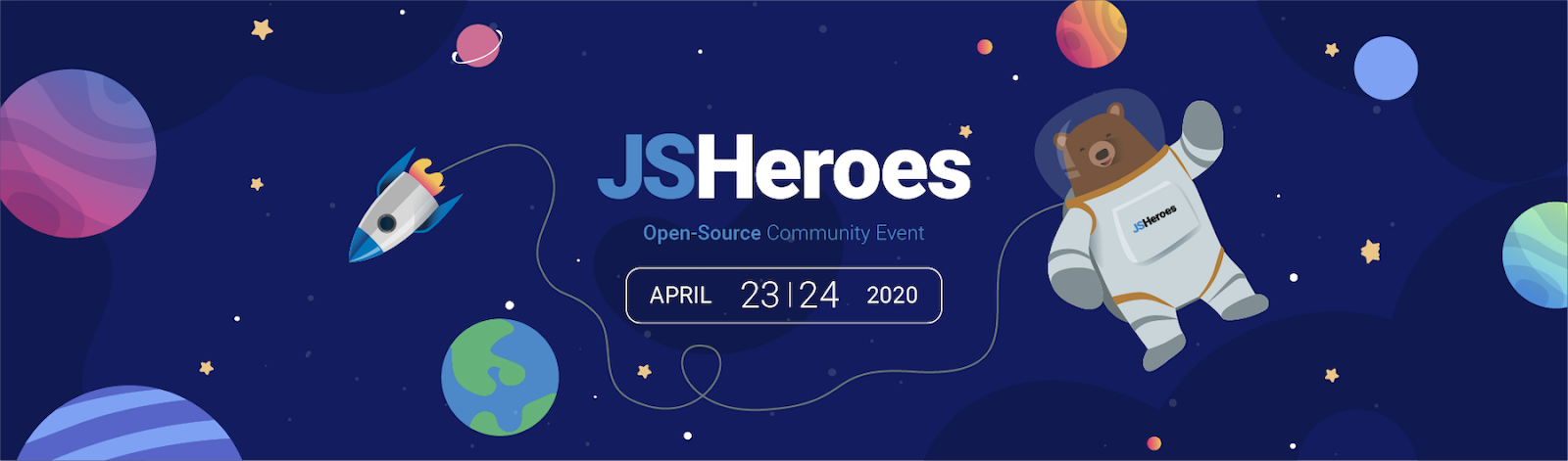
This is the banner for JS Heroes 2020. Again, we have a great use of illustration to add personality to the event homepage. The main focus is the event logo (which is also the event name), but the date is also emphasised. Slightly more subtly, you have the “Open-Source Community Event” sub-heading, which chimes well with the overall design.
My favourite thing about the JSHeroes banner is how it makes you feel about the event. It communicates excitement and possibilities (with the space theme), but also warmth and a sense of community (with the bear astronaut, and the cartoonish illustration style). Great job. 👏
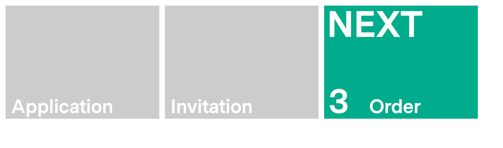
Now for something a little different. NEXT is a carefully curated conference for which participants need to apply and be invited to attend. So by the time you land on the event homepage, you’re actually at Step 3 of the overall process. I really like how the NEXT banner creatively communicates this. The banner design itself is pretty minimal, but the function it serves makes it a worthy example on the list.

HashiConf’s banner makes great use of white space (or in this case black space) to draw the eyes in. The event name, date and location information are presented with a clear hierarchy, and the colourful textured shapes add visual interest without distracting from the important content.
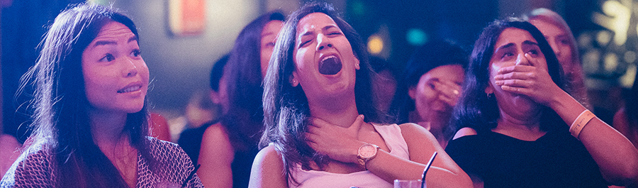
This banner from Story Party’s True Dating Stories series is just a simple cropped photo with no text or embellishments, but it successfully communicates so much about the event. For context, it’s a travelling event series where people talk about their dating horror stories in front of a live audience. And the reactions of the audience members in this photo give you a great idea of what to expect: shock and hilarity!
Whether you go the illustration, photographic, or text route (or a combination) for your banner, I hope these real-life examples have given you some inspiration for how to add some personality and visual interest to your event homepage.
Thanks for checking out another Quick Trick. We’ll see you for the next one in a couple of weeks. 👋