Getting Creative with the Tito Widget: Real Customer Examples
For most of our customers, Tito’s event homepage is central to their ticket selling process. But there is another way to capture registrations.
Tito makes it easy to sell tickets to your event. You simply enter the event details—title, date, location, ticket types and so on—and we generate an attractive and user-friendly event homepage for you. You can link to it from your website, or from anywhere on the internet, and get selling tickets in minutes.
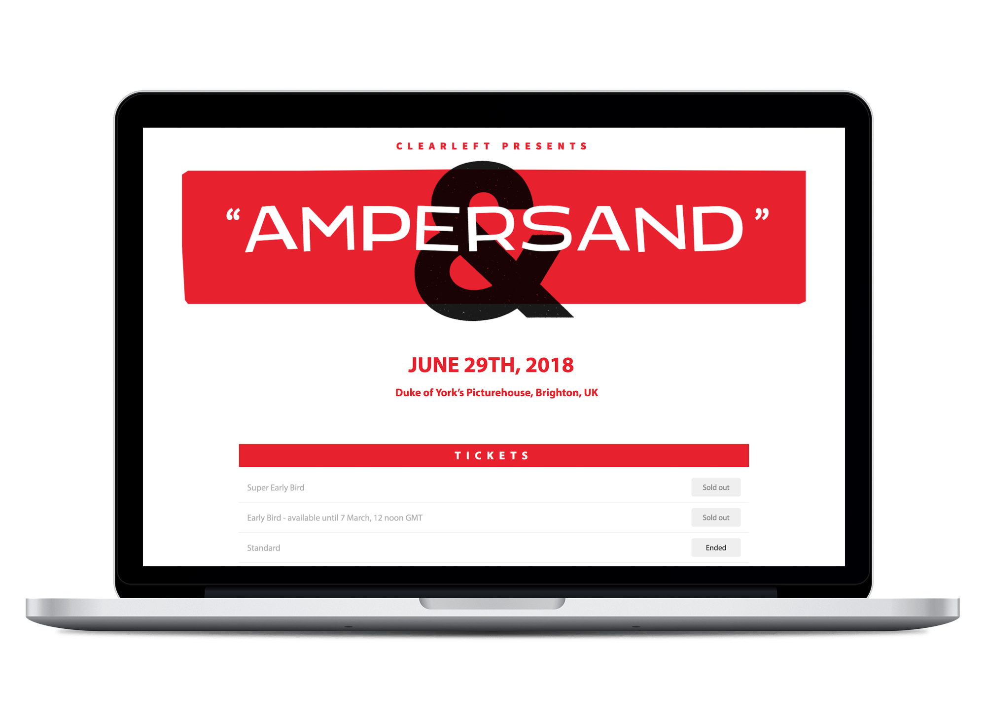
You can even customise it to be in-keeping with your event branding by changing the fonts and colours, and adding your own images. For example, with some simple CSS tweaks, judicious use of red, and a bold Hitchcock-esque header, Clearleft have transformed the look of the Tito homepage for their web typography conference: Ampersand.
But did you know you don’t have to link to the Tito event homepage at all? Our embeddable widget allows your attendees to complete the registration process without ever leaving your website. And the best part is you can make it look and feel like any other part of your website.
Just a few lines of code
To use the widget you simply copy and paste an HTML snippet into your site. It’s straightforward and you don’t need to be super technical to do it, though if you want to start getting creative with the styles you’ll probably need to enlist the help of a developer.
The widget is ultra flexible so you can use it in a lot of different ways. You can display all or some of your public tickets on the page itself, or you can open the checkout process in an overlay window that launches when a visitor clicks on a particular link or button.
Our documentation explains how to do all of these things, but in today’s post I want to give you some creative inspiration for using the Tito widget to add some flair to your event selling process. And what better way than to draw on a few real-life examples of how our customers are using the widget in the wild?
Embed tickets on your site
If you’re familiar with using the Tito event homepage, you’ll know that it contains a list of all your publicly visible tickets and allows users to enter the quantity and type they wish to register.
The Tito widget allows you to display this ticket block on your own site, ready for your developer to style up however you like. You can make it look as clean and simple, or as bright and funky as your heart desires.
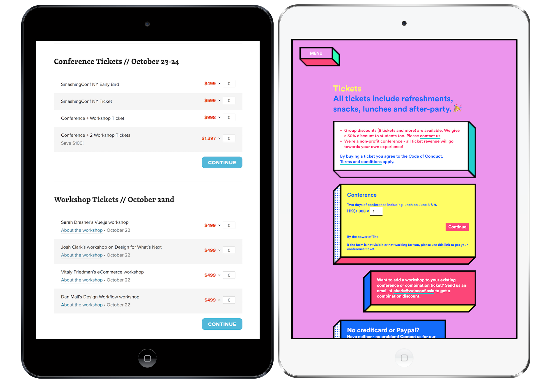
The example on the left is from SmashingConf, who’ve used a simple colour palette and alternating row background colours to display tickets in a clear and digestible way. To keep things even cleaner, they’ve used inline links to additional information in the description under each of the workshops tickets.
WebConf Asia (on the right) went in a different direction with fun use of colour and shape to make the blocks of information stand out. Their ticket page contains lots of useful details, and the yellow registration box is the widget in action. They’ve also included an extra link to open the event homepage in the rare event that some naughty JavaScript blocks the widget from loading.
Both are great examples of how you can style the Tito widget in whatever way best suits your event. And you’d hardly know they’re powered by the exact same registration platform.
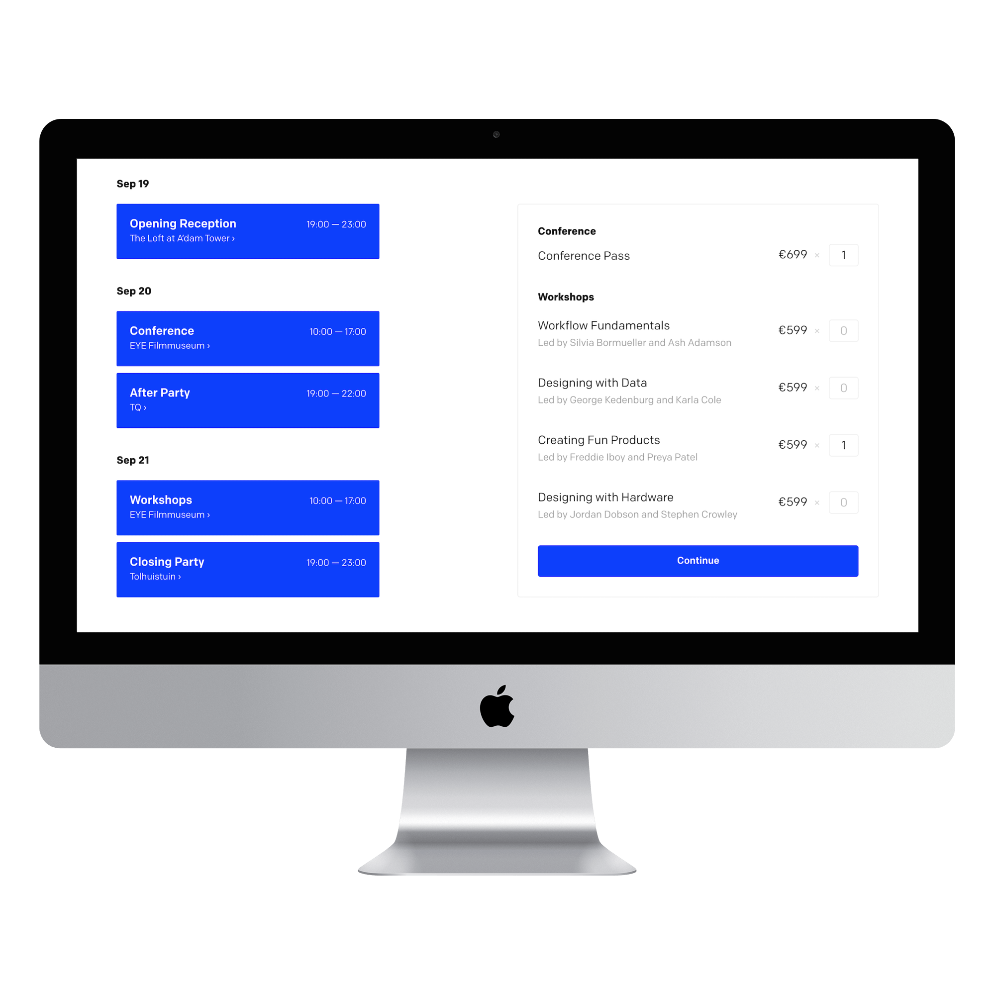
Loupe, a design conference by Framer, have embedded the widget seamlessly alongside their schedule. This way visitors can clearly see what they’re registering for. They’ve also added conference and workshop headings to break up the ticket types. Clicking on “Continue” opens the checkout process right there on the page, creating a frictionless booking experience.
A couple more examples before I move onto what else the widget can do…
Developer conference ColdFront (on the left) have opted for a dark and stormy colour palette and just three ticket types – Early, Regular and Late Bird. By displaying sold out and upcoming tickets, it drives urgency to book at the current price. You can control this under Homepage Settings in Tito. Pixel Pioneers (on the right) use bold text and a white box on a dark background to draw attention to the ticket types available.
Pro tip: In the code you can specify which combination of tickets you’d like to display on the page and in which order, rather than showing all of them. This gives you greater flexibility than the event homepage currently does.
Display a button that opens an overlay
As we’ve seen, applying different CSS styles can transform the look of your ticket list – but it can only get you so far. Perhaps you need to display tickets in a more complex way than simply using rows. Good news: you can still use our widget!
With just a couple of lines of code, you can place a button anywhere on your site that will open the checkout process for any selection of tickets you specify, in an overlay box right on the page. Let’s see it in action…
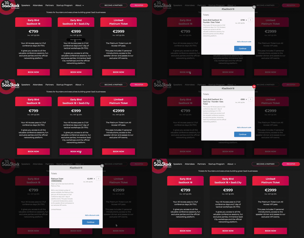
Here, SaaStock display three ticket types in an attractive custom table they’ve created on their site that clearly communicates the benefits of each ticket. When the visitor is ready to make their choice, an overlay opens showing just the relevant ticket in Tito. The customer can then continue their whole booking process right inside the overlay.
UXDXConf display their ticket options in a similar way, presenting the benefits in a table for readability. Clicking on “Book Now” under each ticket type opens an overlay containing that ticket only, and allows you to select the quantity and continue the checkout process then and there.
In both of these examples the widget takes the form of a simple button, which can be styled to look like any other button on your site. You could choose to include a “register” button in the menu at the top of your site and have it open an overlay with all your tickets, no matter what page the user is on.
It’s worth saying that although all of the sites featured in this post come from the world of tech conferences (which makes sense as the widget does require a little bit of coding), you honestly don’t have to be a tech professional to use the Tito widget. A few lines of code is all you really need.
Unleash your creativity
The beauty of Tito is its flexibility. In addition to the widget we have webhooks and an API which allow you to take bits of Tito and build functionality on top of them. We’ve been hard at work rewriting our API to make it even more powerful, so watch this space for exciting developments soon!
But the truth is, you can achieve a lot with very little. Even the humble event homepage can be made to work harder for you, as I showed you in the very first example. I want to finish this post with another example of a customer who got creative to solve a common problem; using a combination of a custom form on their site, and the Tito event homepage.
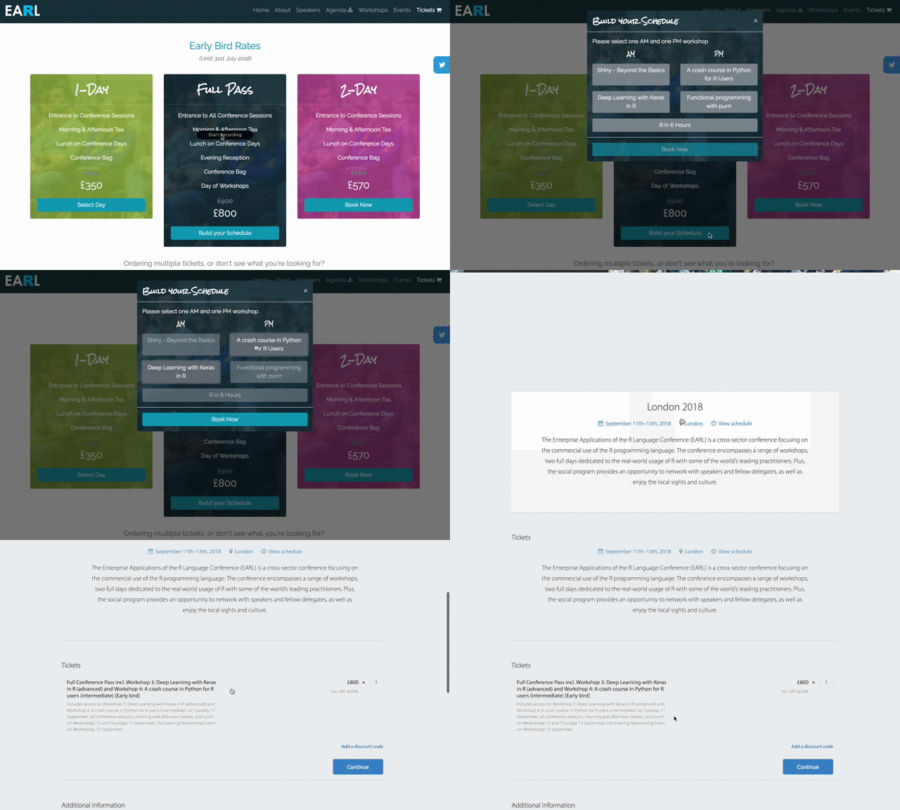
EARL London features a day of workshops preceding the full conference. There are different options in the morning and afternoon, and you can only attend one session during each time slot.
They’ve created a custom flow on their site to allow attendees to “build” their customised schedule, and then click “Book Now” to open the Tito event homepage displaying that ticket only. Every ticket in Tito has its own URL, so this is really easy to set up once you’ve created tickets for all the possible combinations.
Over to you
I hope this post has given you some inspiration for trying out the widget, or even just getting more creative with the event homepage. There are so many ways to customise Tito and make the booking experience unique to your event—and it can be as simple to implement as adding a button and a little CSS to your site.
Are you already using the Tito widget? I’d love to hear from you and see what you’ve done with it. Drop me a line at vicky@tito.io and you may get featured in a future roundup post like this!
