Ticket Purchase Flow: An Evolution
At Tito, we feel our service lovingly serves two core groups of people: event organisers, and attendees looking to buy tickets. We strive to give both the very best user experience possible. We also listen to feedback from both groups very carefully to identify areas of improvement in our product.
These two groups, however, have very different goals and priorities. Keeping them both happy can sometimes be a little bit of a balancing act.
One reoccurring request from event organisers has been for better handling of data collection, in particular when it comes to mandatory ticket information. The traditional solution is to require information before the attendee can purchase the ticket. It’s always been very important to us, however, that our users are never presented with any type of panic-inducing form. So instead, we only ever ask for the minimum amount of information required to complete the transaction. If we’re not providing a fast and simple method for a customer to secure a ticket, we’re doing it wrong. In addition, having fewer form fields up-front can significantly impact conversions.
By not showing the questions up-front, in theory there is a higher chance of blank answers, which is a huge inconvenience for organisers. We were confident, however, we could find a design solution that would keep everyone happy.
We implemented this approach early last year and continue to receive positive feedback from many attendees complimenting the simplicity of the purchase process. However, we still hear from organisers that they are worried about people not filling in data. Anecdotally, we’ve seen pretty good rates of data collection. Úll 2014, for example, has about a 90% fill-rate, as does JSConf US.
The 10% of blanks come under two possible scenarios: 1) people don’t know the answers and 2) people don’t want to give the answers. By requiring answers up-front, we would be encouraging these people to input garbage data just to buy tickets. In this case, we prefer blanks: it’s much easier to find blanks later to remind them to fill required data, rather than having to analyse data for garbage.
We were confident in our approach, but had been aware for some time that the design could be improved. So at the end of last year when Paul got his hands dirty on a refactor of Tito’s payment engine we began working on an improved purchase flow. Here’s a walkthrough.
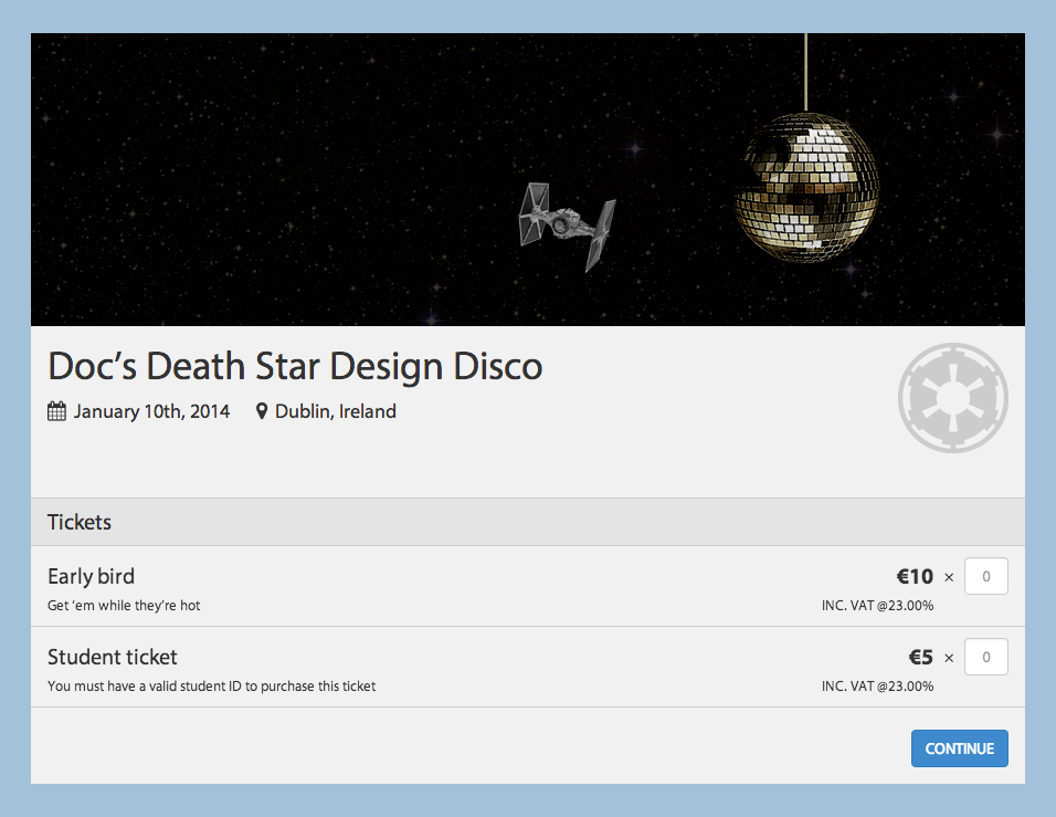
First off, we’ve given the event homepage layout a refresh making more room for ticket names and associated information. There’s also a lighter look and feel having cleaned up some background noise, textures and text shadows.
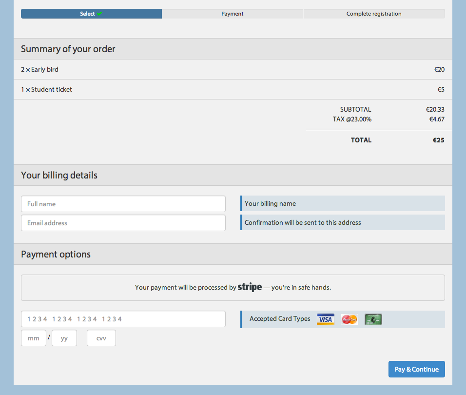
After selecting your tickets, next comes the billing details. For those interested, tickets are yours for 15 minutes at this stage—we only show a timer if all other tickets are sold out. Again, no need to rush anyone if there are still tickets available.
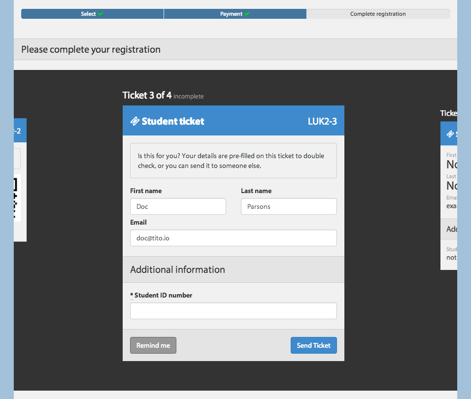
Once you have successfully purchased your tickets, we have a new interface for assigning and answering questions attached to tickets. We bring you through each ticket and allow you to fill details or set a reminder which will email you closer to the event date. Of course, you can come back at any time to complete your tickets.
A pre-release build of this new flow is currently being used by UX London and we’ll be rolling out to everyone else in the next week or so.