Event Homepage Redesign Means an Improved User Experience
Since I started working with Tito I’ve enjoyed being part of the mission to provide the best possible user experience for both event organisers and attendees. After shipping our updated admin UI to event organisers a couple of months ago, I was really keen to apply what I’d learned to the event homepage and share that same love with your attendees.
Designing McDonagh
In considering the design I wanted to ensure that the experience for attendees was top notch. I also wanted to make sure that it would look great with as little effort on your part as possible.
One of the biggest challenges in this redesign was to make sure that I didn’t break the thousands of existing event homepages. After some discussion with Paul and Doc, we decided to preserve the structure and markup from the old event homepage and only change the CSS.
I spent some time crafting the typography to be more consistent with the new UI, improving the hierarchy and adding clarity in the process. I wanted to keep the design treatment quite neutral so that it would seamlessly blend with the wide range of brands and events that use Tito. I introduced a full width banner image — they’re all the rage these days — but I added it to provide organisers with a really nice big canvas to showcase their events visually. The event homepage has always been responsive and I made some small refinements to improve it even further.
Overall, the design changes are small in isolation, but add up to a big impact. The new McDonagh theme is lighter, more spacious, and is much closer to the Tito we are working towards.
Bonus: Themes
Since we were able to update the homepage without changing any markup, Doc and Cillian were able to work their magic and bundle the changes into a theme. Currently there are two themes — Classic and McDonagh. We hope to release more in the future, as well as allowing you to create your own custom themes to perfectly match your brand.
How can I use McDonagh for my events?
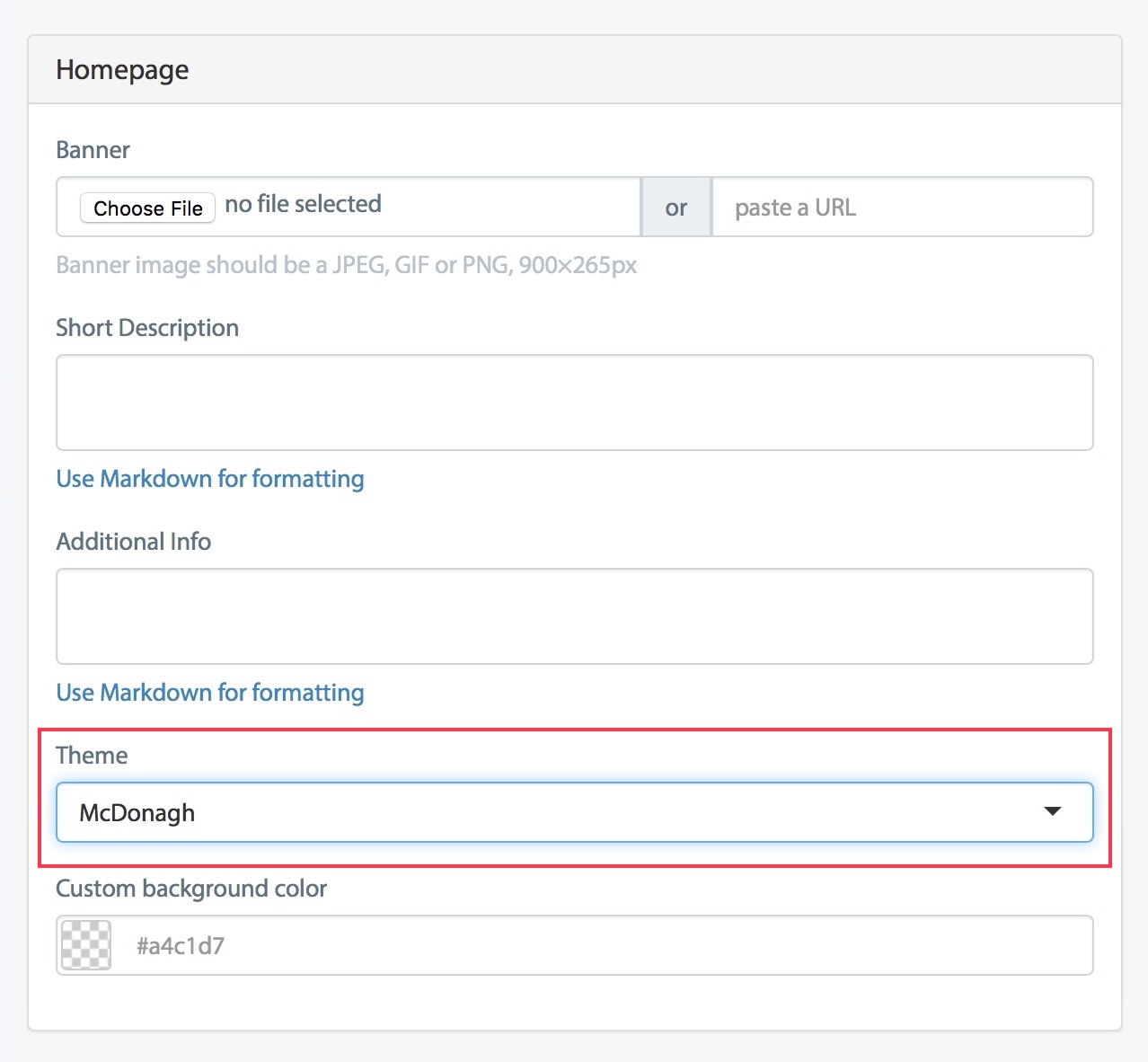
As of today, McDonagh is the default theme when you create a new event in Tito. If you have an existing event you can switch to the McDonagh theme by going to Customise > Homepage from your Tito Dashboard. If you have any custom CSS (private beta feature) already applied things might break so please exercise a healthy dose of caution and good judgement.
From here you can write a description for your event, add additional info, a map and a banner image as usual. To take advantage of the new design you don’t need to do anything differently, but it is worth taking a little time to choose a really great image to make the most of the full width banner. I recommend using an image sized 1800 x 530px which will look great on all screens.
I hope you like the new design and are proud to share it with your customers. If you’ve any feedback please feel free to drop me a tweet @useTito or @petermcdonagh_.

