Testing 30 Productivity Tools in 30 Days | Week 3
For weeks one and two of this little experiment, you can go here and here respectively.
As the headline or a previous installment of this series might tell you, I recently decided to try out 30 productivity tools over the space of a month to provide our readers with honest feedback about how well they performed for me, and how well they fulfilled their purpose, whether that’s streamlining a process or saving its users time.
Here’s the full list of the 30 productivity tools that I tried out:
Week 1 (Available Here):
Day 1: Facebook Newsfeed Eradicator
Day 2: Momentum
Day 3: Forest
Day 4: Zotero
Day 5: Tabagotchi
Day 6: The Most Dangerous Writing App
Day 7: To-Don’t List
Week 2 (Available Here):
Day 8: Ginger
Day 9: Marinara Pomodoro
Day 10: Noisli
Day 11: Webtime Tracker
Day 12: Productivity Tracker
Day 13: Brain.fm
Day 14: Bubbl.us
Week 3: (This Post)
Day 15: Rescue Time Lite
Day 16: F.lux
Day 17: Draft In
Day 18: Portent Content Tools
Day 19: Monday.com
Day 20: K.Notes
Day 21: 135 List
Week 4: (Available Soon)
Day 22: One Tab for Chrome
Day 23: Water Reminder for Chrome
Day 24: Habitica
Day 25: HabiZest
Day 26: Do Nothing for Two Minutes
Day 27: Coffitivity
Day 28: Station
Day 29: Realtime Board
Day 30: Stay Focused
As with the previous posts, I’ll be using a star rating system out of five to give you a high-level overview of how I got on with the sample of tools we’ll be discussing today. I’ll also express the frustration or delight I experienced, depending on the situation. To begin…
Day 15: Rescue Time Lite
I love this thing. I love percentages. I love knowing when I’m being lazy. I love knowing when I’m not because then I’m free to love myself. It’s revolutionary, it’s stunning, it’s so easy to use. I am besotted.
*clears throat* Not that that’s out of the way, I should probably tell you how it works. Rescue Time analyses all the sites you use in your browser, knows which ones are time-wasting and which are not, and divvies up your day to tell you how long you’ve been on each kind.
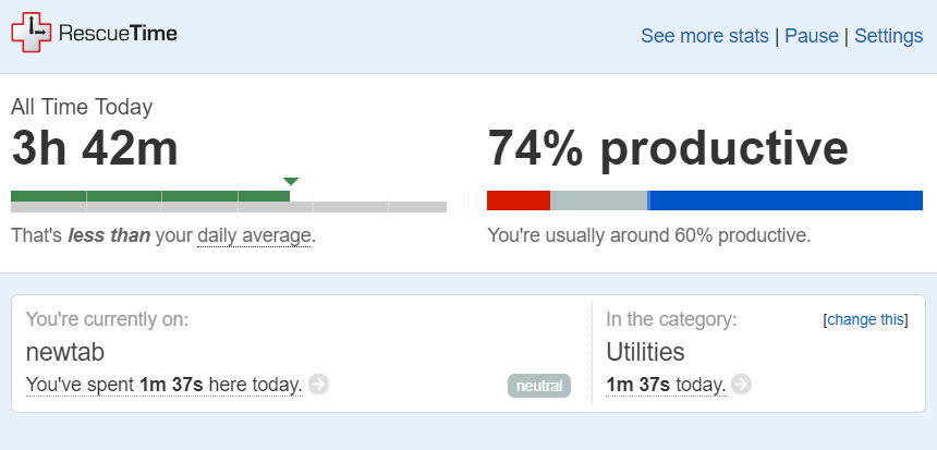
Image Description: A screenshot of my Rescue Time dashboard. I was 74% productive and had logged 3 hours and 42 minutes at the time I took it.
But, beyond that, it shows you how you’re doing hourly, daily, weekly, and monthly. It allows you to categorise what different sites mean to you and how productive they are. And, neatly, it gives you a productivity pulse, which means that you get a two digit number to tell you how productive you’re being overall.
Obviously, in a day, I didn’t get to all the features (and this is only in the free plan) but it’s fascinating. You can set yourself goals, you get chipper little responses telling you how well you’re doing or encouraging you to do better.
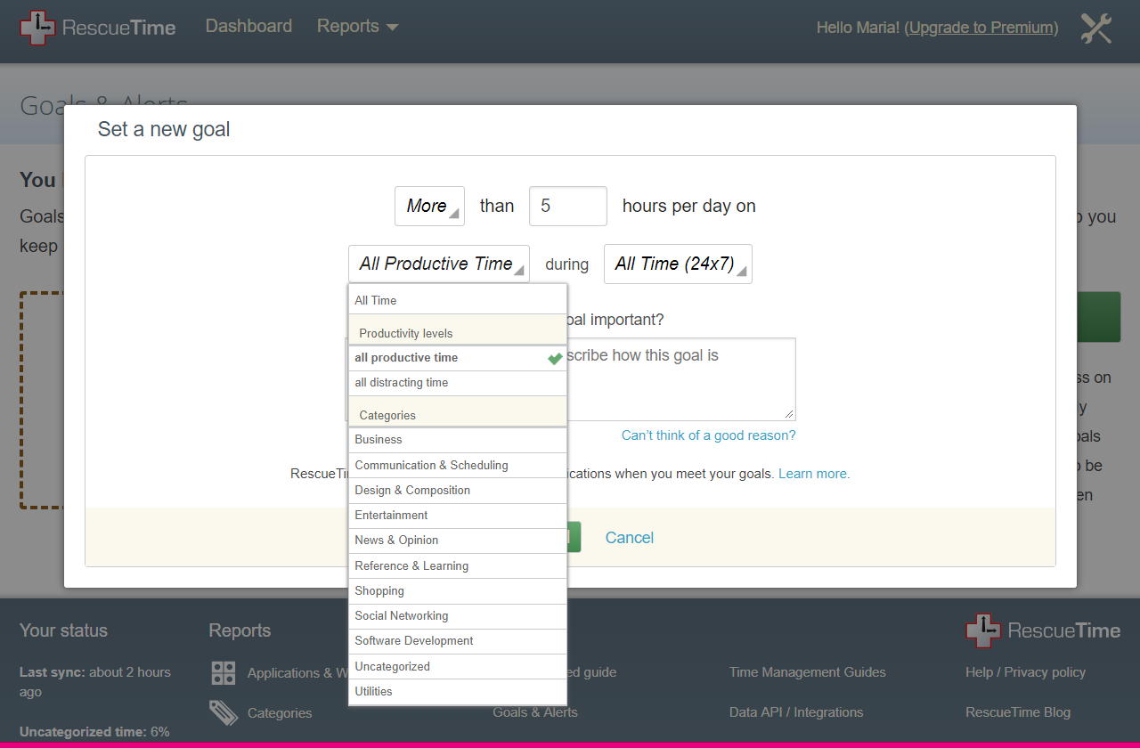
Image Description: A drop down of variables from the Rescue Time goals page, including business categories and hours per day.
You can also input your work hours. I’ve found that really handy to tell me to STOP WORKING when it’s not work time. I mean, if you really need to, you can of course track the overtime/extra hours you’re putting in, but I love having that reminder. Overall, it’s wonderful. Everyone should use this.
Star Rating: (Somewhat obviously) ⭐⭐⭐⭐⭐. Actually, ⭐⭐⭐⭐⭐⭐. It’s my rating system, so I’m happy to break it.
Will I use it again?: Yes. Every day for the rest of my life, probably.
Day 16: F.lux
This is a little different to its predecessors on the list. F.lux is based around the sun and helping you rest. As someone who works in an office alongside three people with children under the age of three, I can tell you that I know sleep helps you focus.
F.lux tracks where the sun is in relation to you based on your coordinates and dims/adds warm filters to your screen as the sun sets so that you can adjust naturally alongside it. That’s supposed to help with sleep, headaches, focus and a host of other things.
I’m one of those people who uses blue light shade on their phone, but not on my desktop. Who uses a sunrise alarm clock, but who’s happy to watch YouTube for 2+ hours after they go to bed.
So, I thought I’d try it out for its sleep-based promises. For context, I use a knock-off (I know) FitBit, so I have a fairly accurate idea of how much sleep I get any given night. (Usually around 7-8 hours.)
Image Description: A screenshot from F.lux showing when the sun will set and when it rose that day.
I woke up 15 minutes late the morning after I installed this.
However, I got to sleep earlier than usual, hitting the pillows at 10:45 after reading a book for an hour or so. I woke up pretty shattered regardless, and on the way to work I nearly threw my Keep Cup in the bin, mistaking it for a disposable.
I cheated a little bit and gave this another spin the following day/night in the name of compiling some more data. It didn’t give me much more insight. I still have this on my laptop, and it does help with eye strain a little, but I couldn’t see (no pun intended) any other advantage. To be fair, I already use a few different methods to help me get sleep so I might just not have been a good candidate for this one.
Star Rating: ⭐⭐. It’s nice, but not massively useful.
Will I use it again?: Yes, I still use it, but again out of novelty rather than anything else.
Day 17: Draft In
Old habits die hard in me. I tend to approach tools that aren’t mission-critical with weariness. As a marketer, and a content/inbound marketer at that, writing tools are one such type. I have old faithfuls. My preferences are Google Docs, and good ol’ Microsoft Word, so I was a little skeptical when it came to day 17.
Draft In is a simplistic writing tool that provides a distraction-free environment to type and compose in. Whether this is all down to habit and preference or not, I didn’t enjoy it. I can see the benefits of just having a blank slate to type on (in a nice font, I will add) but there are some things that online publishing requires that a plain text editor can’t do for you.
In Draft In, I found myself yearning for a way to Ctrl + K hyperlinks for referencing. I also wanted a word count, something I think makes sense in terms of tools for writing, no matter how minimalistic they aim to be, especially if we’re talking in terms of productivity.
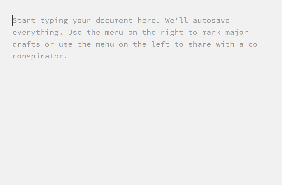
Image Description: The dummy text of Draft In: “Start typing your document here. We’ll autosave everything. Use the menu on the right to mark major drafts or use the menu on the left to share with a co-conspirator.”
Furthermore, when I copied and pasted my work from Draft In into our CMS, it was double-line spaced by default (any manufacturers of such software, please listen to me as I beg you to clear formatting in cases like this) so I had to go back and delete all of the spacing, thus sucking time. Not a huge amount, but it was still annoying.
I will say Draft In seems like a great choice for anyone writing fiction or other forms that don’t require embedded or cited reference material. I’ll go back to it when writing a short story, perhaps, but when it comes to business tools, I don’t see this being fit for many purposes.
Star Rating: ⭐⭐. Sorry.
Will I use it again?: No. It just doesn’t fit my needs. Again, sorry.
Day 18: Portent Content Tools
Ah, content idea generators. They’re generic, but sometimes they work. That sentence isn’t exactly what you want out of a productivity tool; having to trawl through useless information to find golden nuggets.
Portent’s tool works by plugging your keywords into different sentences that are typical headings you’d find online that are designed to get clicks.
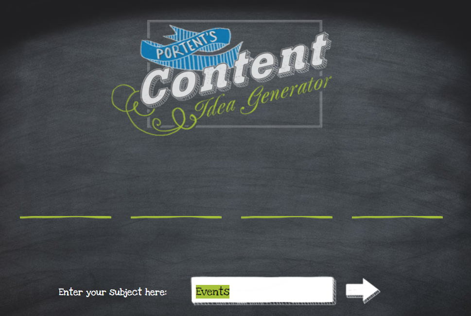
Image Description: The Portent Content Idea Generator interface prompting you to enter your subject/keyword. “Events” is in the subject area.
Not to be a grumpus, but this kind of thing seems useless to me. I don’t want to write clickbait titles, even if the article they’re in front of is quality. It seems dubious and a bit condescending to think that your audience will want to read something they’ve seen a hundred times before.
What I will say is that this isn’t a bad tool. This might seem like a contradiction, but the permutations are great if you’re starting out writing about a topic. While I wouldn’t personally recommend using the titles this tool generates verbatim, I can see the value of using the ideas as a launchpad for your own titles and themes.
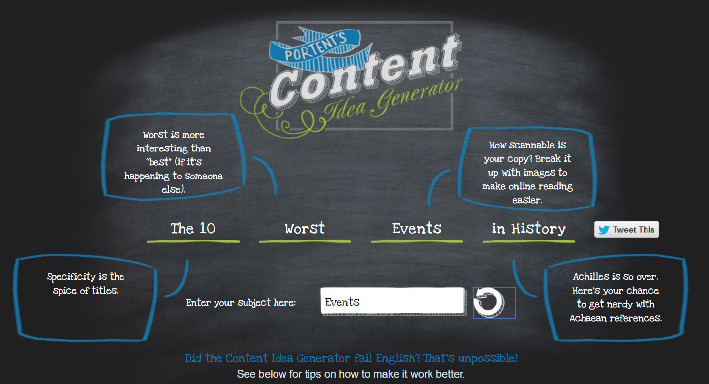
Image Description: The Portent Idea Generator giving a sample headline of “The 10 Worst Events in History”.
Star Rating: ⭐⭐⭐. Potential, but not a straight-up tool for auto-generating good posts.
Will I use it again?: Perhaps. I kind of prefer the alternative tool provided by HubSpot simply because the user interface is more appealing, but I might use a combo of both when I’m brainstorming at a later date.
Day 19: Monday.com
After having this shilled at me via YouTube ads for some time (bad) I decided to bite the bullet and take out a trial of Monday.com on a Monday morning, no less.
It’s pretty good. It took me a while to figure out that I’m a visual planner but this re-emphasised it more than any other tool I’ve ever used. Monday.com allows you to organise information and tasks that your team is due to complete in lots of different ways. It has lots of nifty features to help you prioritise, deadline and show progress, so I can see how it would be great for projects assigned across a large team.
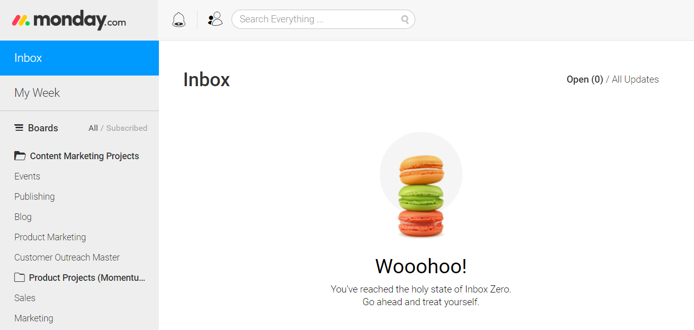
Image Description: A screenshot of the Monday.com dashboard.
You can also search for a tag across the whole system, which is pretty cool. I often use this functionality in Slack, but having it in a project managment suite is a game changer.
Since my initial trial day, we’ve somewhat adopted it across the marketing and comms team to track project progress, deadline publish dates and assign tasks. We’ve found it doesn’t work quite as well for some projects as it does for others, so I’ll reserve a full team review, but my honest opinion after day one was that it has a lot of potential.
Star Rating: ⭐⭐⭐(I deducted one of those stars for the aforementioned shilling.)
Will I use it again?: Yes. Today in fact.
Day 20: K.Notes
This is the tool on this list that I adopted fully the quickest. Full stop.
I now use this every day. K.Notes is very similar to Momentum, in as far as it lives in every new tab you open with a nice visual. I even got a little illustration of a tennis court one day (the day after Andy Murray got his hip surgery, to be precise) and as an avid fan, I really appreciated the quirk.
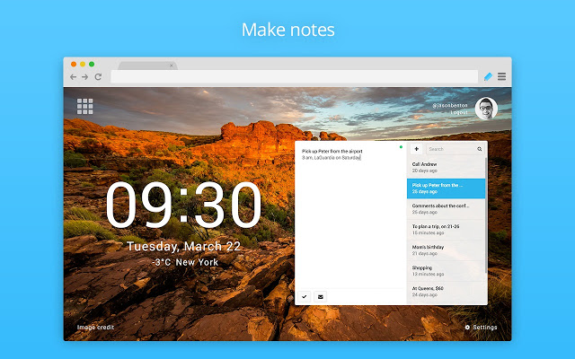
Image Description: K.notes as it appears in Chrome. It displays the time, date, temperature at your location, and your list.
I used the functionality mostly to make a daily to-do list, as well as a weekly one. The lists show you your percentage progress on your tasks, meaning you can get an idea of how far you’ve gotten with your day if you match it up to what percentage of your office hours you have left. It’s so simple. And, it’s just SO easy to use. Big fan.
Star Rating: ⭐⭐⭐⭐⭐.
Will I use it again?: Yes. Today, tomorrow, yesterday and as long as I can.
Day 21: 135 List
The idea behind the 135 list is that you divvy your to-do list into one big task, three medium tasks, and five small ones. I used this in-browser meaning I had to have the tab open all day (and it didn’t have an SSL cert, tsk tsk).
However, this irk could obviously be circumvented by using it on your phone, but I’m just not that kind of multi-tooler. In fact, my phone is usually on Do Not Disturb all day, unless I’m expecting a business call, a far cry from my time in sales, but I digress.
The premise seemed really appealing to me, but the issue I ran into was identifying what big, medium, and small were. We were switching one of our marketing systems at the time of my using this app, so I made organising data exports the big task (which it was) but then my day kind of lost the run of itself.
Two meetings were due to take place that day, both of which were pretty substantial, so I put those in the “medium” slots. However, both got pushed, and there was no way to reschedule or add them to the next day’s list, which was a little annoying, as it meant either deleting them or having them undone on the list all day.
When it came to small tasks, I added a minor editing job I had to do, as well as an invoice I had to pay, and a video call I was due to attend. The issue I ran into with these is that they were pushed to a very minor priority and I neglected one of them as it could be dealt with another day, thus kind of defeating the purpose; I was really just adding them to the list to fill in the blanks because I needed five things.
In any case, I think this was a case of good idea, poorly tailored.
Image Description: The 135 List layout. One big thing, three medium things, and 5 small things with the option to add unlimited other things.
Star Rating: ⭐⭐⭐. It’s a good tool, but only if it suits your way of working.
Will I use it again?: Maybe. I’d be interested in giving this another chance when I have a huge workload on a plate on any given day and when I really need to prioritise.
We’ll be posting the final installment of these reviews in the coming weeks. To find out when and stay up to date with what we publish on the blog, you can subscribe here: