The Story Behind Our Conference Design Principles and Practices
We host a community event series called Úr, which is an Irish word for “fresh”.
It kicked off in spring 2018. From the design point of view the key themes that Dearbhla, our designer, had to work with were “fresh” and “cocktails”. And, with a slick stretch of her imagination, this is the final design that she came up with and which Doc animated.
I mention Úr here to show the way I approach design direction when curating events. I look for key themes; usually the event’s name and the atmosphere I’m trying to create. Before the conference was christened “Admission” I got stuck on using another Irish name. I fell into that trap other organizers will be familiar with: sticking to what worked for the past event, even though the next project is very different.
The Irish words that I pitched didn’t look nice, and their meanings had tenuous links to the conference at best (at one point I cited Irish folklore.) Any reasonable person can tell you that Celtic warriors have no links to event planning, but in the moment I refused to see that. Worse still, to a non-native speaker’s ear the Irish words I selected sounded like a cat choking on sandpaper. Thankfully Vicky, our (British) head of customer experience, had an inspired moment and suggested Admission. She steered the ship away from Celtic warriors, towards less muddied waters.
“Admission” is such a great word. There are many layers to it, despite the obvious. It speaks about entry to a place of ideas, meeting and exchanging experiences with new people, and old friends. Before teasing out the concept further for Dearbhla, I watched Bryony Gomez-Palacio and Armin Vit discuss their design process for their hugely popular conference, Brand New Conference. It’s well worth the watch to fully understand the thought, effort and care they went to for their attendees.
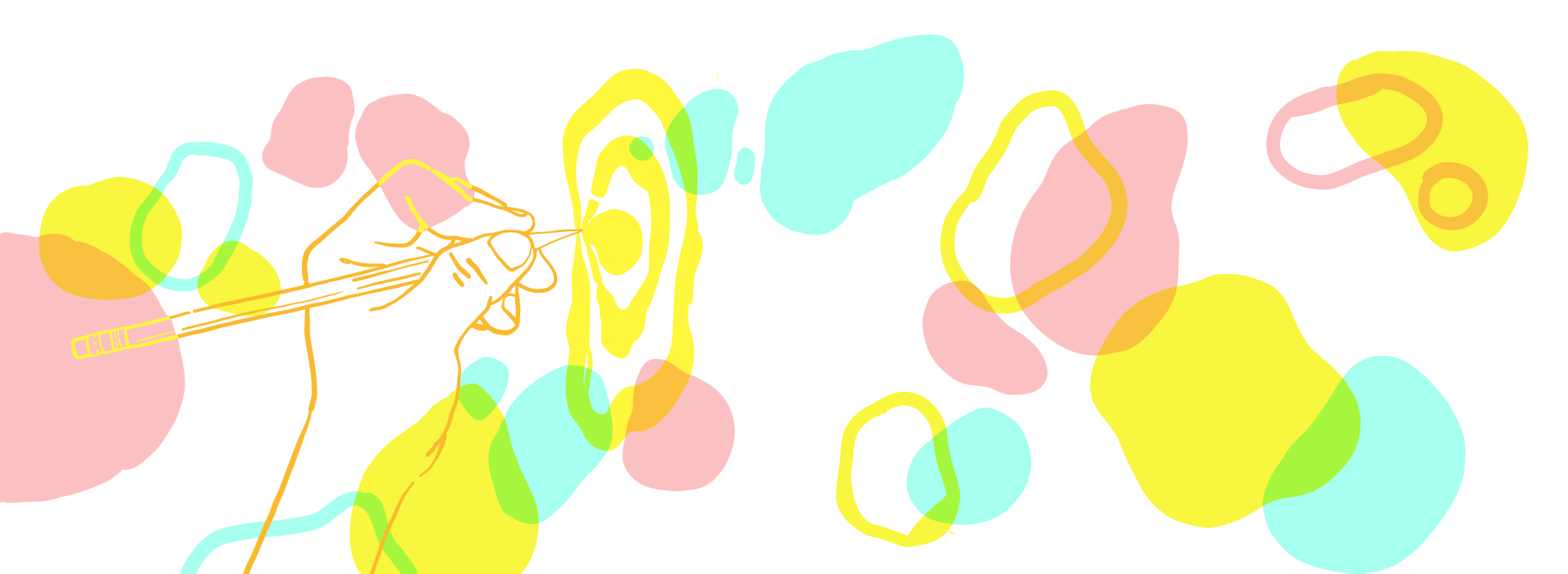
It’s a wonderful moment when a designer can take your words and vague ideas and turn them into something better when you’re planning to host a conference. Dearbhla came back to the team with four different types of patterns. All of them, bar one, were very literal such as the elements that make up an event; tickets, stages, microphones, etc. But it was the pattern that was just shapes, or blobs as we will call them henceforth, that hooked us all. For me it was the purest and spoke to a moment. Dearbhla put it best when she explained her rationale,
“I wanted to explore why people go to conferences. For me it’s about intersections of people. It’s like an osmosis of ideas.”
With that in mind you can see that the blobs overlap, acting as the intersection of different ideas, conversations and moments. On the landing page they float over the speakers’ images which again feeds into the overall theme of connection and intersection. The contrasting colours work well together because they are so different.
All of these facets come together to foster something that represents the diverse perspectives we hope to enrich ourselves with at Admission, our conference for organizers. To see the final design, you can visit the site here: